
SIGNAL SENT!
WE'VE RECEIVED YOUR MESSAGE AND WILL GET BACK TO YOU SHORTLY.

 KISAW
KISAW
by nika and vanya
by nika and vanya


Early visuals by the founders:

Process visuals:

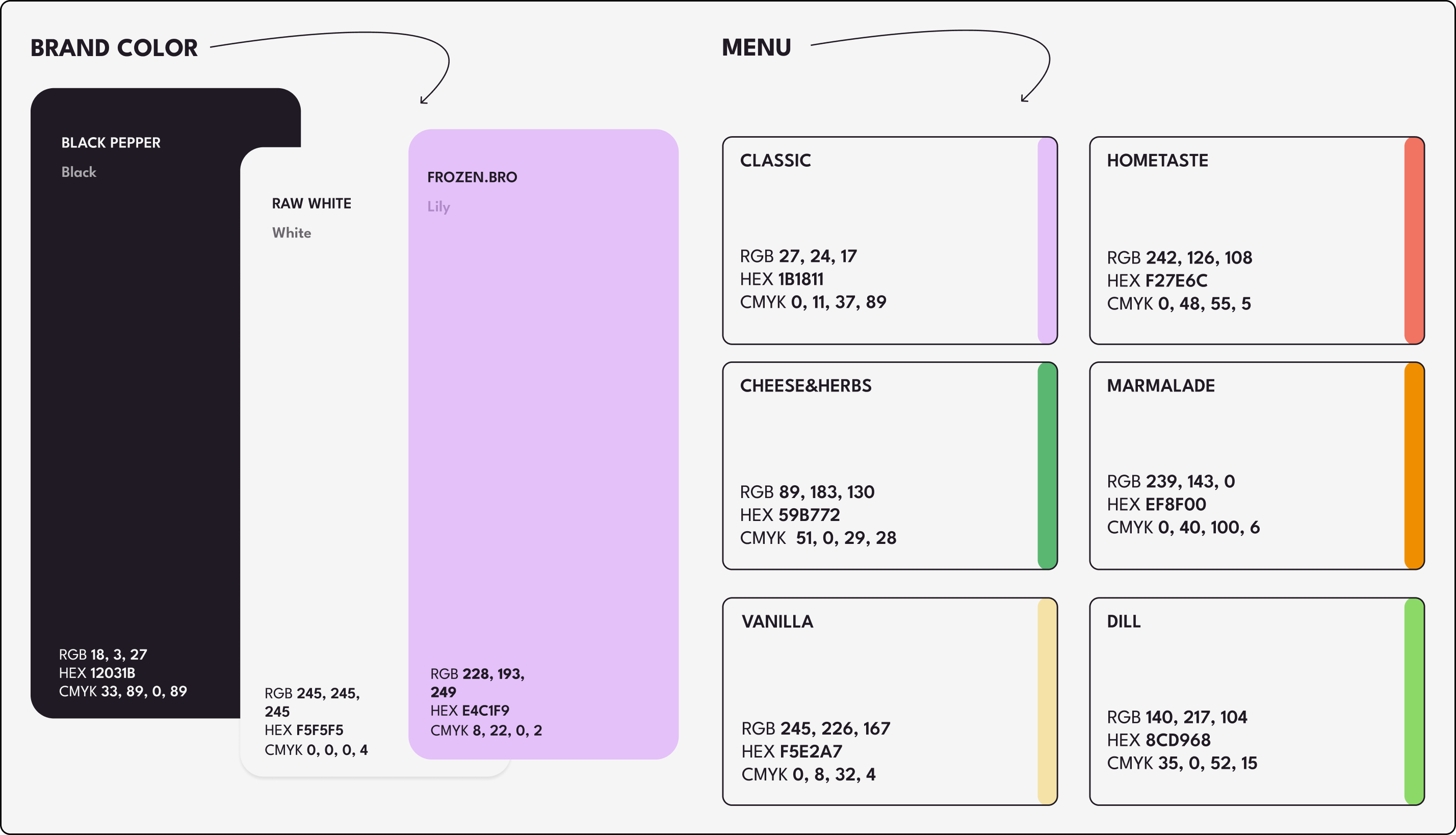
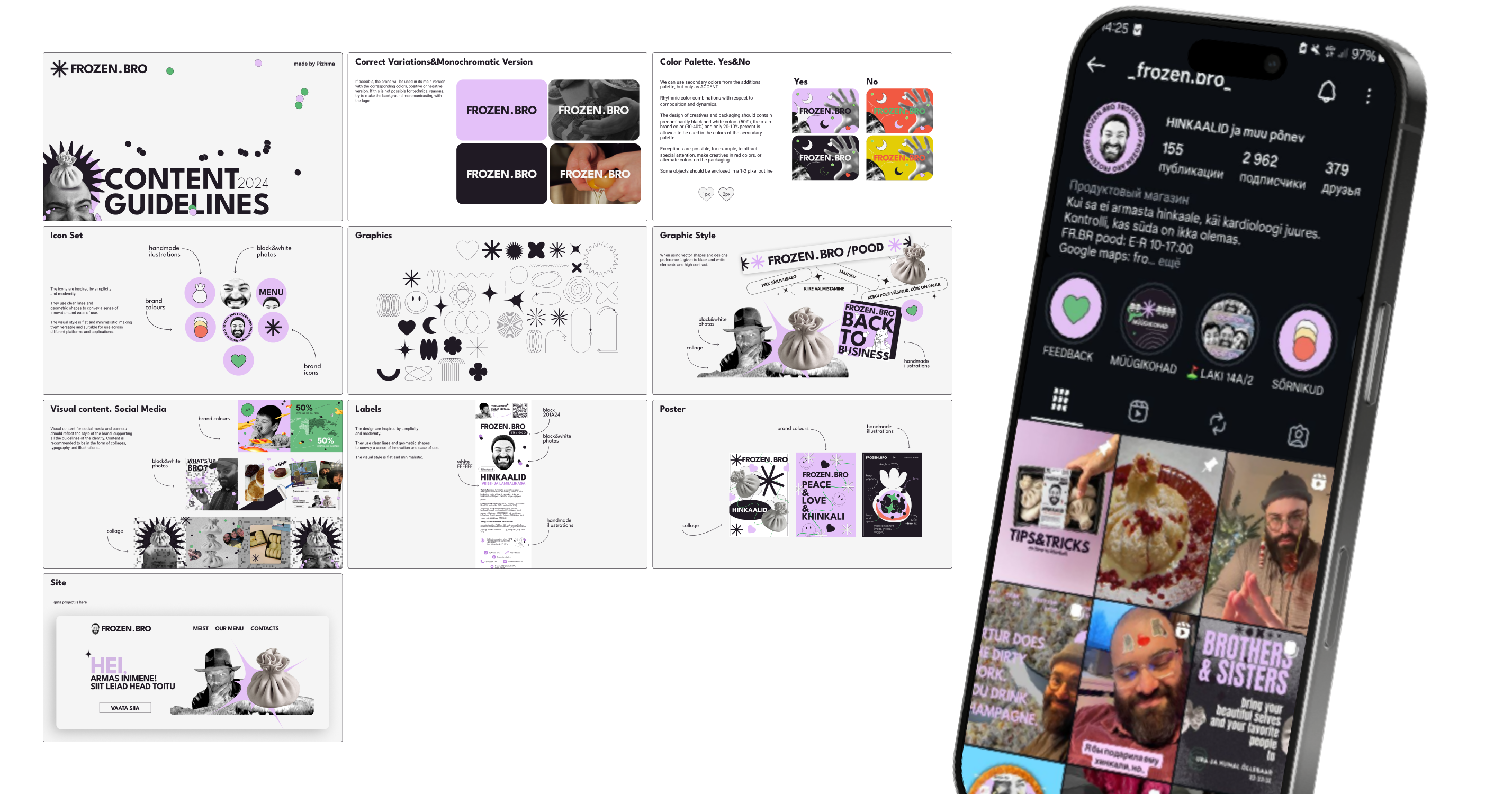
Part of Base Brandbook:

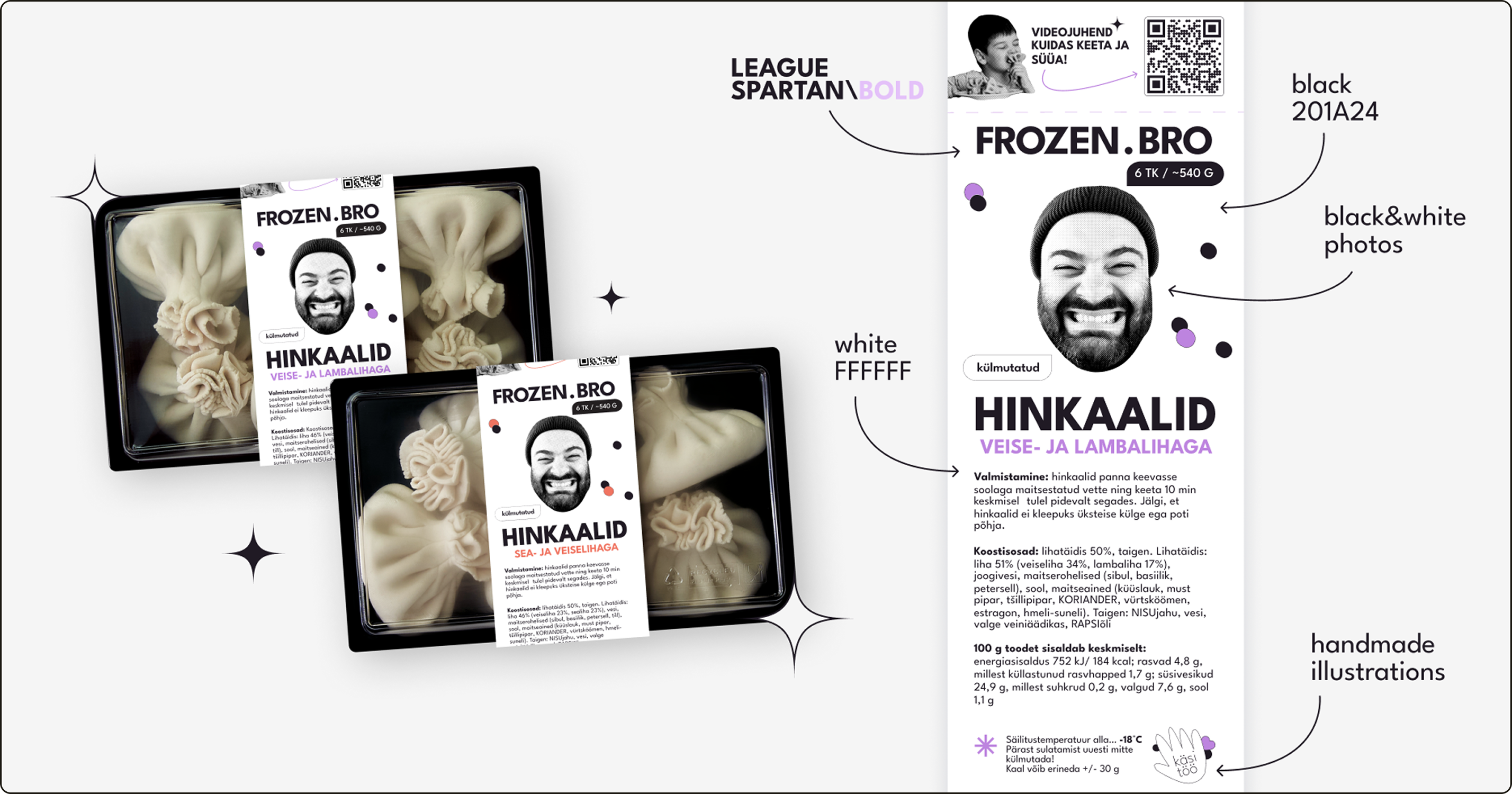
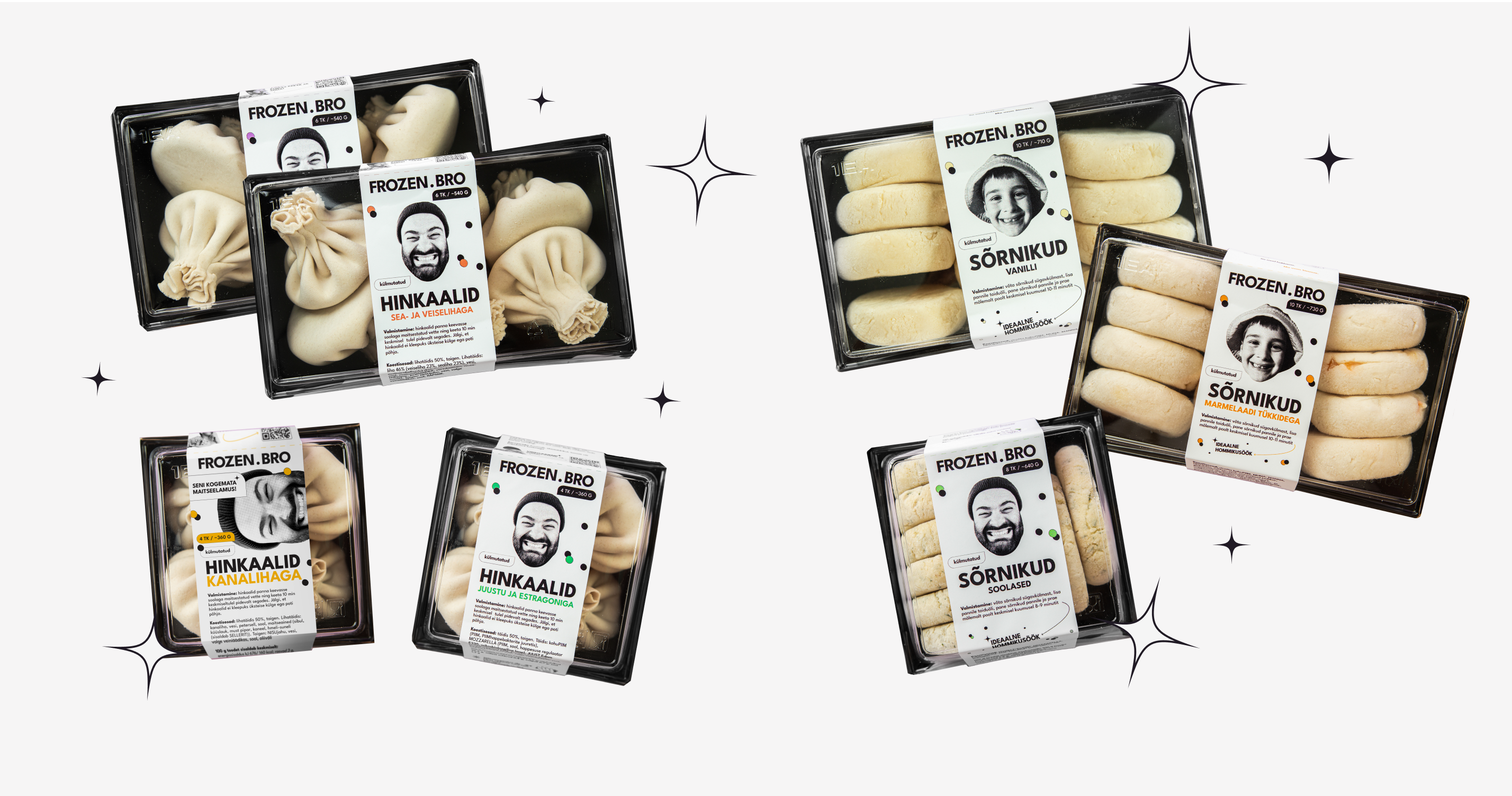
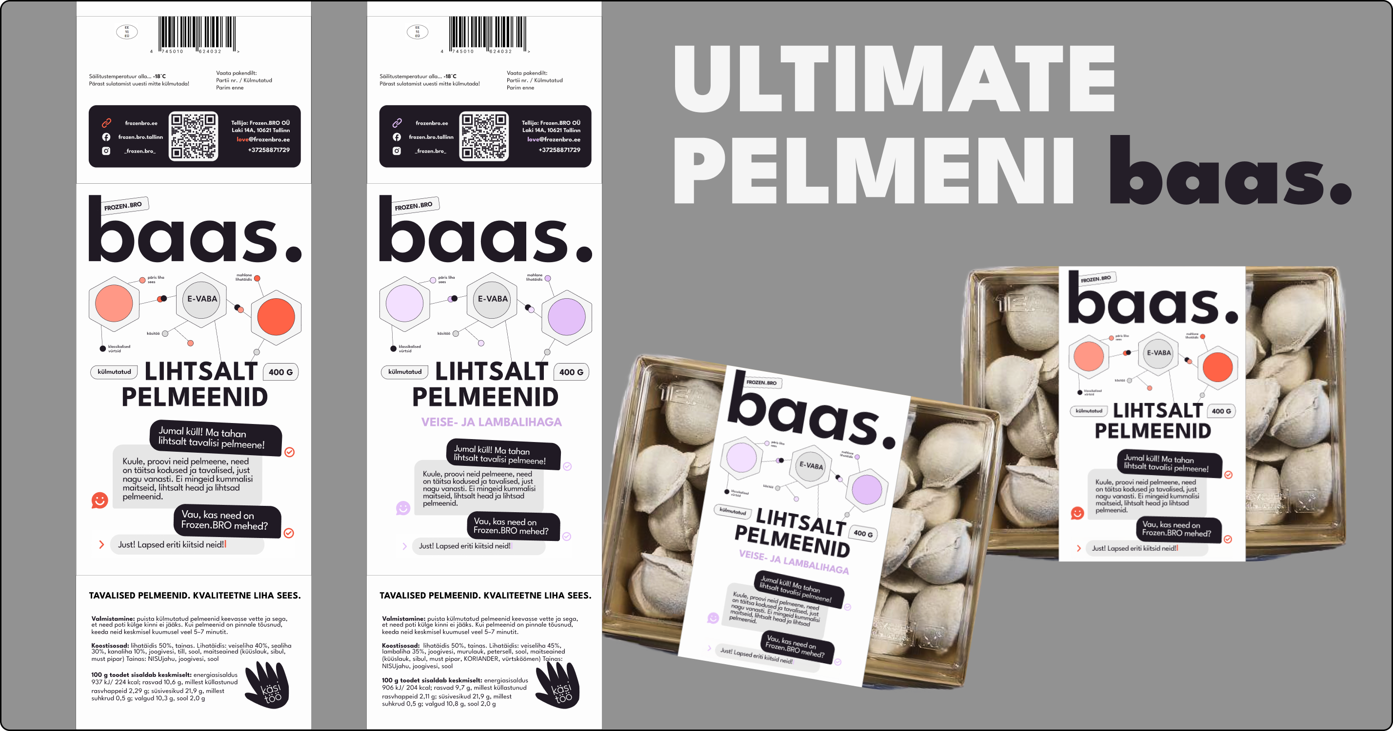
Part of Package Brandbook:

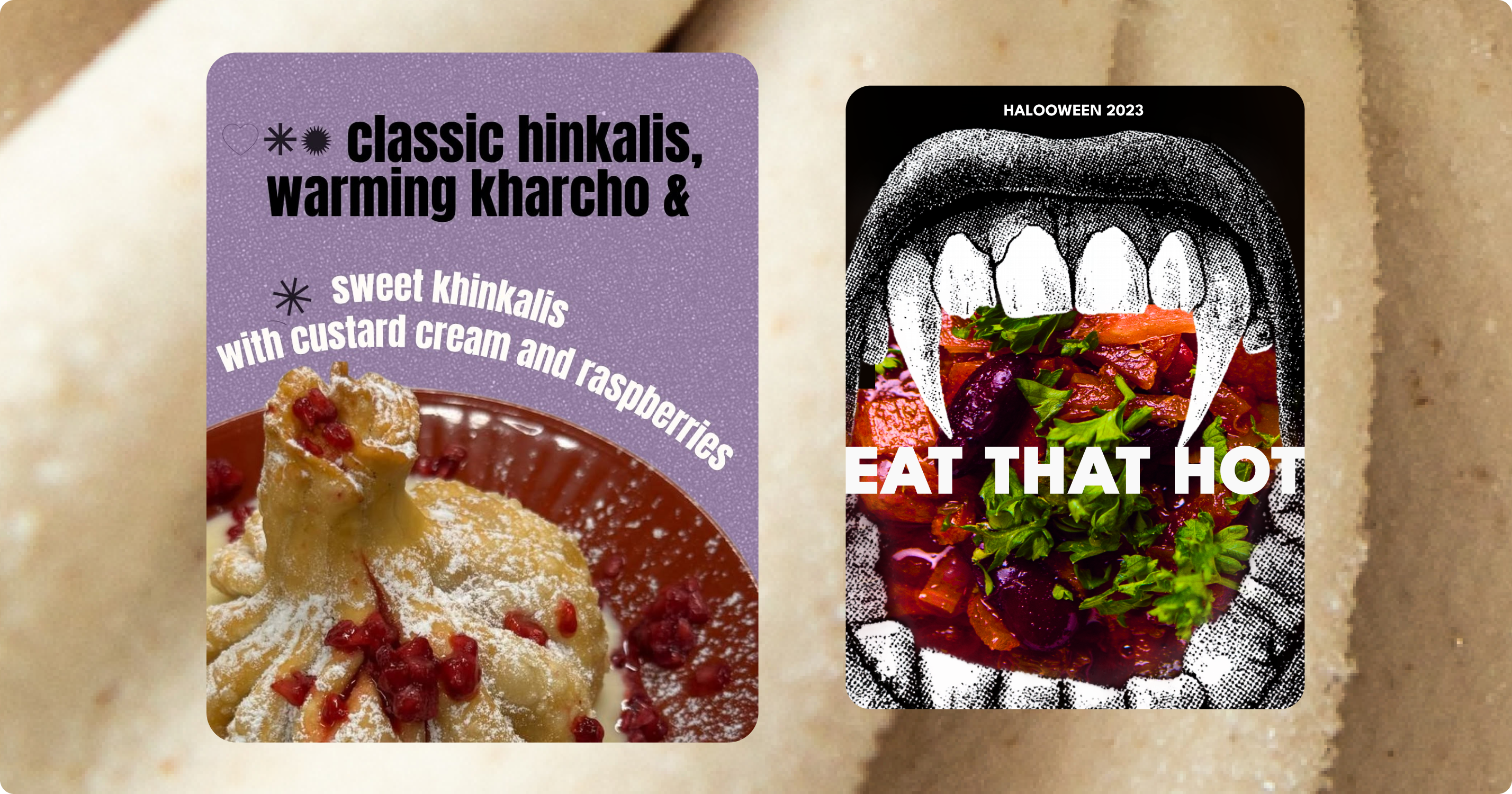
Food Photo and Retouche:

Part of Content (SM) Brandbook:


Tell us about your project.
We'll review what
you
have, listen to your ideas, and
propose a clear direction for how the project should look, sound, and communicate.